Design Process: 27th Letter
In this entry of JOURNAL: TALKING DESIGN I’d like to walk you through Pedagogy: Design Thinking. I have the formal process written here, but I know examples help clarify sterile terms and definitions. I talk a lot about design, probably more than about art, because I think I am a designer and because I think design heavily influences art. In this example I am using an exercise called The 27th Letter to show design thinking, as well as integrating critical thought, drawing and Adobe Illustrator to make a well considered addition to the alphabet.
Choosing A Type Face

To begin I chose three type faces; Bodoni 72, Adobe Garamond Pro, Times New Roman. I decided to only use a serif type face. I felt a serif font offered more design options. This is simply a personal choice as well as a design constraint. As you can see from these samples I began to explore each typeface in detail: terminals, stems, counters, etc.
Form: Positive and Negative


Hover over any image and click to enlarge it to see more detail.
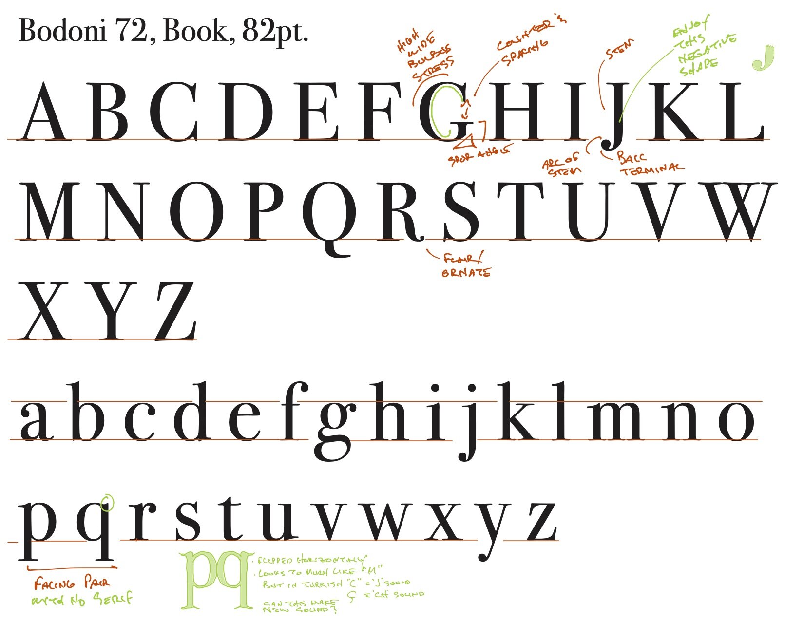
In image #02, you can see my notes at ‘J’ I am looking less at the glyph itself and more at shape, as (a) form - having positive and negative potentials - specifically at the arc and ball terminal. Some may take issue with my initial starting point, and that’s okay. As designers form is an integral component of what we look at and what we make. We do not merely look at form from the stand point of, say, page composition, but also as 2-D design, or 3-D structures as well.
For example, again in image #02 look at the detail of ’p’ and ‘q’ as they face off against each other. What I noticed was they have similar descenders and counters. But, they differ in one distinct way, the ’p’ has a serif or ear where the ‘q’ does not. To me this is significant and began to influence my design choices.
Also, note the red line underneath them, is a further type of interaction. By drawing the line I am making a note regarding spacing as well as making a kind of measurement. Both are working together in my mind and continue to influence my investigations.
In Image #03 the sketch in green (I did all this on there iPad Pro using the Apple Pencil and the Zoom-Notes application.) is my initial design based on my observations of ‘p’ and ‘q’. Crucially though, this time they connect to each other. You can see other alternations I made. First, I gave ‘q’ a serif/ear. Here I am looking into symmetry; counters remain basically the same, descenders and their serifs are basically the same, as well. It seemed to make sense each should have a serif. My notes are important also because they (a) critique what I just drew, (b) relate to sounds glyphs and sounds made in Turkish (this note helps me better understand the use and eventual context of my letter as you’ll see), (c) I am thinking about sounds. All of this is very important because my 27th letter needs to be more than an academic exercise in design.
Good design reflects understanding and use, that is needs and context.
In Image #04 my next iteration in blue reflects how my design in evolving. It may be a stretch to see, and that’s okay if design goes way out there, I am wondering about a new letter ‘H’. I am also thinking about sound and syllables. You can see that in the case of one syllable I am simply adding a single vowel with the letter ‘t’ at the end. This becomes an effective method for testing the efficacy of my design. In the case of multi syllables I have opened my options, that is to say I am no longer confining myself to a single consonant at the end but am allowing myself to find words that support my idea.
Note: In this exercise I gave myself no other constraints than to use a serif type face. This closed off a set of design potentials while opening up others sets.
Returning To ‘J’, Making Something New

In Image #05, above, I return to my earlier exploration of ‘J’. Those earlier forms were interesting and seemed to provide impetus for further design investigation. I treat design with rigorous and scientific strategies. This is why I have a system in place and while I believe students benefit from a strategy as well. My investigations utilize traditional forms of media; pencil, paper, writing, critiquing. Methodological. As artists we can utilize a scientific method in design and to tremendous benefit. So bear with me as I walk you through this because the first design is not nessecaarisy the best. Be fearless and look for other solutions. So, as I said, I returned to ‘J’. As was interested in its arc at the stem and its ball terminal. I believe there was a new design waiting to be brought out.
A New Letter Is Designed

Image #06 is showing several things. First, in blue this sketch is from both inside and outside of the stem. I’ve also added a serif and an ear. This is as much an intuitive response as an understanding that those elements need to be present since I am integrating this new glyph in a serif type face. In the second sketch, in orange, I have refined the serif and added the dot. In the earlier examples the letters sat on a base line that I drew. The third sketch shows a rough base line as well as a rough median. This is important because I need to keep my new letter within the proper specifications. Keeping within those specs my drawing became clumsy. That’s okay, though, because I have all there information I will need in the preceding drawings.
Also, I am once again trying to determine the usage of this letter. In my hand written notes I am playing with a long sounding ‘I’. By integrating an ‘I’ into the ‘c’ I am attempting to show how these two sounds can be incorporated into a single letter.
Steps: Cleaning Up In Illustrator


In the following images #07 through #15 you can the various steps I took, but not everyone, as I moved closer to the final letter form. In almost every step I compared my new 27th letter against existing glyphs looking for the most effective design that will make the new letter seamless within the existing letters.
Understanding
Okay, by now you’re probably wondering what this has to do with design, type, the 27th Letter, graphic design. The main point to remember is that this is an exercise demonstrating Pedagogy: Design Thinking. Of course it reveals something of myself as a designer but equally, and likely more importantly it demonstrates how design, if left to evolve and expand will under exciting transformations. You have to control those, meaning you must know the needs and context of the project. And while this is how I am as a designer it goes on to explain why design affects every aspect of how thinking and making. Lastly, it affects everything I ponder and do, and the way I teach as well.
So here’s why this is so important, in order to successfully design we have to understand what and why we are designing as well as understanding our own manner of designing.
We Are Problem Solvers
In Graphic Design, we are problem solvers and in order to do this we have to understand process and methodology. We do this via three process steps.
Empathizing- Associative and design thinking
Interpreting- Logical Thinking, Methodology
Researching- Logical Thinking, Methodology
In Empathizing I needed to understand what the 27th Letter was supposed to accomplish. Here is where I began early investigations into what is normal for the project goals, or would this project be novel and abnormal. Knowing what has, or has not been before gives me insight. Investigations lead to observations and these, unless data driven and scientifically proven, are likely subjective. Just know the difference. This where mood board fit in, though I didn't use one the 27ty Letter.
To Interpret is a natural step arising from empathy, though not necessarily a linear step, as interpretations can be layered and varied. Look for unique understandings and begin to formulate a questions for each interpretation. Also, how have others attempted to solve this problem. There is insight here, let your intuition roam even while being logical. Here is where to use your sketchbook for quick drawings and written notes.
Now Research, I cant say enough about research. If don’t prioritize this you're missing big component and undermining your design direction. This logical thinking for sure and vital to the overall system. In one way you’re synthesizing the first two steps but you are also looking for deeper level of understanding. For example, why have earlier attempts failed? Finding a key reasons why can keep you from making the same mistakes. At this point you’re developing a working paradigm.
As I worked through the 27th Letter assignment I gave myself constraints that were designed to contextualize. By this I mean, the 27th Letter had to be more than an assignment. In fact, this is generally how I work. It makes the process realistic. This enriches the assignment and gives purpose to my design. In essence what I am doing, is Empathizing and Interpreting. This means I try to identify, or be in tune, and, also, clarify and explain the meaning. In order to do this accurately, requires research. My design begins to reflect these steps. These will seamlessly, naturally lead to another series of steps I’ll explain next.
Critiquing My Work
Going back to my preliminary designs these focus on some important observations. First, these really reflect form. You can see (in detail J) that I have become interested in capital ‘J’. Precisely wear the stem descends into the terminal. I was very interested in the negative space form inside and around Ball Terminal and Arc of the Stem.
Secondly, here was energy in the combinations of black and white. This is a good time to talk about inspiration and associative thinking. My training and experience and love of form - composed of negative and positive space - help me see something new and untapped. Whats my process here? Well, I drew inside (the negative space) and outside (the positive form) and over the Stem itself. This is how I create my first version of a lower case 27th Letter. I say first version because all I had was an idea. It was solid or refined but was crude. And most importantly it did not match the glyph style of Bodoni 72. In fact I doubt it matches any contemporary letter form.
Process and Strategies
So I’m talking a lot about design. I’m running you through my process. Which is not to say this is the only, or best way to design. It just happens to be the process I used. Here is why am talking so much about the process. I place an emphasis on problem solving, creative approaches, design and art-based brainstorming and problem solving. To do this you must have a strategy. Tools, like Adobe Illustrator refine your design only. It really doesn’t help you design. It helps your design have polish and to contextually fit. It also becomes useful in a variety of uses because it is vector based. So I emphasize design processes because these are what make us designers.
Having this mindset and a process helps you become a better designer, reach client needs, excel professionally. But even more important than all those you come away with sense of accomplishment and feeling excited and content in your work.
The Next Three Steps
The next part of my process works through another set of steps.
These are:
Define- Associative and design thinking
Hypothesis- Logical Thinking, Methodology
Ideate- Associative and design thinking

To Define I had run my new designs through these steps. I was able to define my 27th letter by understanding this developing glyph in its greater community. This meant it could not deviate from the typeface Bodoni 72- it still had to have the defining characteristics of the typeface, i.e. serifs, terminal width, spacing, as well as angles, and curves within the smallest elements of Bodoni.
Using Hypotheses I began thinking about its language context. My mind ran through various languages I had some familiarity with.
For Question I asked myself, What if my new letter made a complex sound and was composed of two letters?
To Answer the previous question I felt could do this. Now, I continued this line of thinking because the design reflected, or already had characteristics making this possible. (Show example here.) When designing be loose and be alert to new discoveries. Don’t be so tight in your idea you aren't able see something new. In fact being rigid in your idea is contrary to Synergistic Thinking.
In Statement I was confident this would work. It reinforced my design and its idea of creating a sound. This moved me to the next step, ideate.
To Ideate I pushed this idea further. What if this new letter reflected a sound whose letters combination was not as common as the same letter combination that created a different sound? Here I am recognizing a solution that I think is going to solve the 27th Letter problem.
Final Steps In the Process
In these next examples you’re going to see how began working through the last steps.
Verify - Logical Thinking, Methodology
Prototype - Associative and design thinking
Test - Logical Thinking, Methodology
Test - Associative and design thinking

These last steps are intended to prove design and accurately and targetedly finish the project at hand. Also, you will notice how knowledgeable you have become, how literate in the project specification you are, and how articulate you have become. This means you can talk trough the process, answer questions specific to the choices you made and how able you would to both defend those choices or make adjustments to your design.
To Verify simply this means you’re comparing your design choices and direction against your observations and idea development found in Hypothesis. Here is where you have to be fearless in your methodology because you need to become objective when verifying. There is no room for bias or emotional attachment.
In Prototype this where you can begin preliminary finishing. I say preliminary because as you can see made seven prototypes. Each version closer to really hitting the target. This was also moving me closer to the last Test step.
To Test the methodological kind of test that measures your solution against all of your previous steps. If you have missed the mark somewhere along the line you need to go back and get back on track. Or, if you're on track and still see the merit in your choice of design then you can feel confident you have been successful.
And to Test , again the associative kind means now you have to see if works in the context it is designed for, meaning, does my new glyph really work. Does meet the design standards of Bodoni 72? Is it a readable and speakable glyph? Do the rules I assigned to letter combination work grammatically? Did the ‘ci’ sound of cipher reveal less words in that letter combination sound than the ‘ci’ sound of city?
Again, the formal process can be seen here Pedagogy: Design Process.